Duly Noted’s “Ecosystem”
Current clients know and love it. We are now excited to share with you the first publicly available visualization of how Duly Noted creates optimal conditions for client growth!
Drumroll please… Introducing the Duly Noted “Ecosystem.”

This graphic has undergone numerous iterations, as it was not only designed for but also designed by our current clients. As we walk you through the lifecycle of the ecosystem so far, we will share some of the specific insights we accounted for in the graphic directly based on client feedback. Let’s begin with the first “version” — more aptly described as a scribble in Emily’s client session notes notebook. She mocked up this hand-drawn sketch during a session with our very first client; Emily’s goal was to help the client visualize the interconnectedness of psychological, communicative, and sociological-level factors when addressing interpersonal relationship issues.
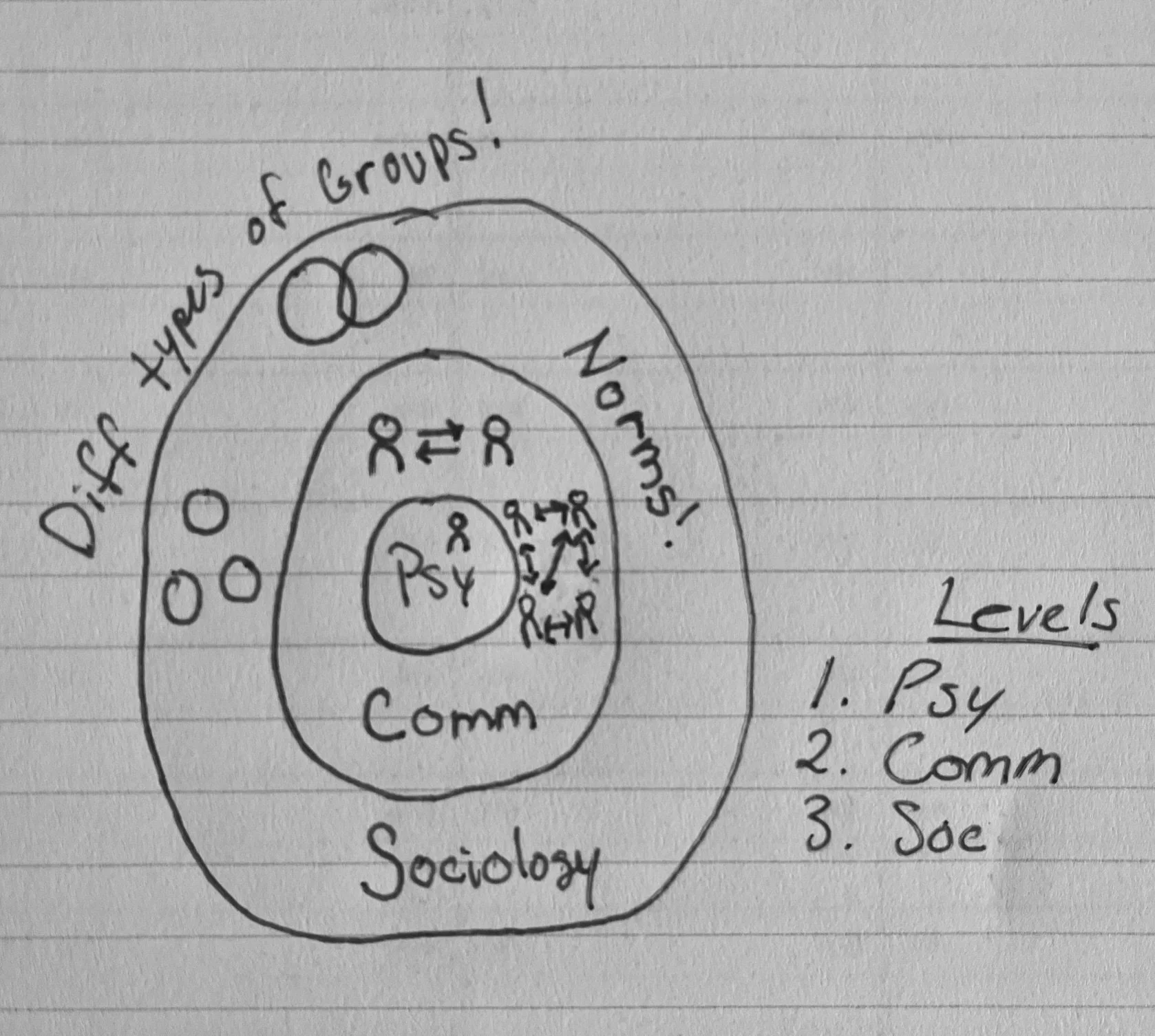
“I kind of think of this drawing as the Ecosystem’s ‘big bang.’ It was the first moment I knew I needed to create the visual that would ultimately turn into the version of the Duly Noted Ecosystem we have now,” Emily said as our team reflected on the journey to bringing this image to the public. “I also knew then that there would be a million iterations of the Ecosystem; it was far from finished then, and probably still has lots of evolving to do as the company grows and clients continue to provide feedback,” she added.

There are a few too many versions to share them all, but here is version 4.0 (in case you were curious which iteration this was). When asked for feedback on this model, our clients had a lot to say! “The circles were better, much more holistic feeling, which feels like the point,” one client commented. Another stated, “I think the triangle shows some things well, but not enough interconnection visually. What about a literal picture?”
A literal picture. Emily knew instantly after reading this feedback that a major missing piece to the visual was just that, an actual image. She jumped into brainstorming how to depict the complexity of the various research fields she draws upon to best serve our clients, and surprisingly, it didn’t take long before the idea came to her. Emily loved earth science as a young learner. The images of how the water cycle moves across and through the Earth, the “slices” of the Earth showing its layers, and so many other visuals from those early 2000s Earth science textbooks flashed in her mind.
Emily felt so strongly that the logical next step had to be some kind of earth science analogy. “Think earth science textbook meets insightful human-centered poster,” she described to the team as she pitched her idea. Admittedly, her idea was a good one, but how to connect the social science research disciplines to a hard science-style visual became an important question to answer.
Clients again offered essential feedback on the process, explaining that the space analogies Emily posed felt too broad and abstract, and were no longer relatable enough. Emily ditched space themes for some combinations of her favorite analogies about how animals interact with their environment. These ideas were met with the opposite feedback; we’d gone too specific now. So, Emily sat back and thought for a few weeks about what might reside in the exact right place, the middle ground between Earth’s critters and the space beyond our atmosphere.

The answer was so literal that it was practically comical. Emily began Google searching, and it brought her right back to her original mental image — a water cycle diagram reimagined to represent the social sciences. Like an archeologist digging into Canva, the bones of the graphic were right there for Emily to reshape into an analogy perfect for conveying the methods used here at Duly Noted. The decision to opt for a water cycle-based visual felt serendipitous, as it afforded the perfect opportunity to utilize Duly Noted’s brand colors: light blue, deeper blue, and chocolate brown, which Emily chose to represent the elements of air, water, and earth.

“I’d used the light blue color of the sky to represent communication before in our brand kit color pallette; we live, breathe, and thrive via communication just as we need air, but until I was looking at a visual that just happened to connect back to the very colors I selected for the brand itself, I’d forgotten the analogy I needed was something I’d already baked into the very fabric of the company itself.”
While she’s not a graphic designer, as a mixed-methods researcher, Emily is no stranger to creating and processing information in all sorts of visual models. From the base image above, the Duly Noted Ecosystem quickly sprang to life. Our clients contributed to the visual elements and provided feedback on the copy. “When Emily thought to collaborate with my therapist, it was a game changer for my wellbeing. I think having that level of service represented in the graphic will show people just how integrated Duly Noted’s practice is.”
Through multiple iterations and consistent contributions from clients, who provided their perspectives, we arrived at the final product. As noted earlier, Emily wants to ensure there is always room for improvement. So, while this model is fantastic and we are thrilled to share it with you, know that there’s a good chance “Duly Noted Ecosystem 2.0” will emerge at some point in the future.